Web design techniques are constantly being refined to suit the needs of Internet users. Trends have been used and discarded, new ideas tried and tested, but here are some tips that have contributed to many successful user interface designs.
#1: Quick/No Registration
Long registration processes that require a lot of unnecessary personal information are likely to turn people away from a website. Instead, allow visitors to browse before setting up an account so that when theyre ready, theyll be happy for the quick sign-in when they return. Require only minimal information so that its not a hassle to register.
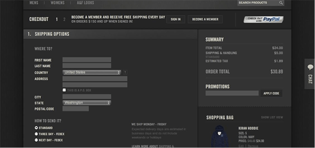
Abercrombie & Fitch allows shoppers to not only look around and add items to a shopping cart, but also to check out without registering. This is a great way to let visitors try your product, and then get rewards for becoming a member if they decide to return.
#2: Iconography
Icons are an effective way to communicate with visitors. Because most people like to scan web pages rather than digest every element, visual cues help guide users take action. Its important to respect conventions when using icons. Be creative, but dont try to reinvent standard images. You ultimately want users to understand your message, and making obscure icons can get confusing.
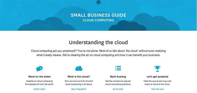
This cloud computing guide makes use of helpful icons to illustrate the users different options. Its clear what the icons are for, and their style and color reflect the brands image without causing confusion.
#3: Untraditional Layout
Most websites are designed on a traditional grid pattern of columns, but layouts can be experimented with. This is a good way to show your creativity in a way that still offers a functional site, but is interesting and eye-catching.
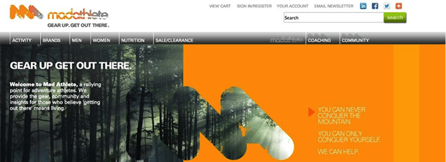
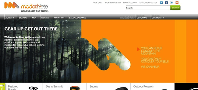
Using ecommerce software, Madathlete integrates its logo into the page layout in a unique way. By overlapping the image with the colored background and continuing the photo in the logo, the viewers eye is immediately drawn to the logo, and the brand is associated with its message of connecting with nature.
#4: Light Color Scheme
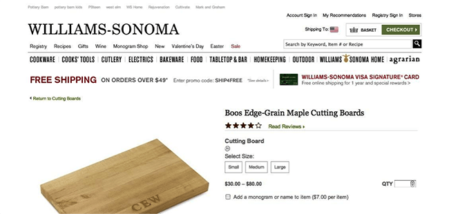
Minimalism is a big crowd pleaser because of its lack of clutter and confusion. A popular way of achieving this is using a lot of white space and neutral colors.
Williams-Sonoma has a simple site that uses minimal color to emphasize a functional design. It conveys professionalism and encourages user action.
#5: Creative Navigation
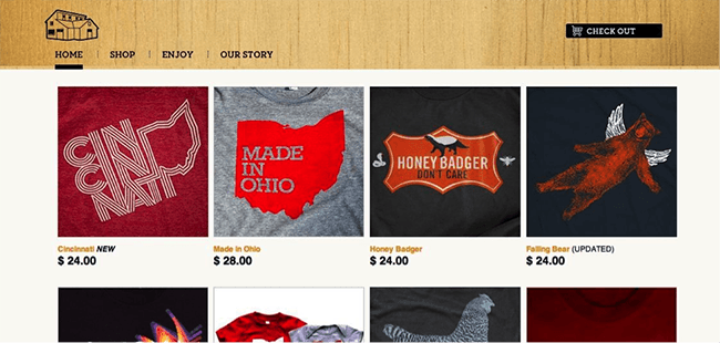
While you should stick to an uncomplicated navigation system, you dont have to go with the run-of-the-mill home page with a menu bar on the side. Experiment with the way users can browse through your site; just make sure the system is still clear and easy to use.
Wire & Twine uses its home page as a product page as well. Its clean and simple, but instantly shows the viewer what it has to offer and draws them into shopping mode.
Feel free to get innovative with the way you use these techniques, but keep their premise and purpose in mind to give your users a great experience with your site.
About Author:
Luke Clum is a graphic designer and developer from Seattle who is crazy about videography, alpine climbing and earl grey ice cream. You can follow him on Twitter @lukeclum

webdesignsurface
February 10, 2013 at 9:14 amThanks for that post � nice