Banner/billboard ads have a tendency to be pretty boring when it comes to their design. If you live in an urban area, you probably see billboard and/or banner ads every single day and if so, you probably never really take much notice of them. This is because they usually don’t give you much to look at; instead, they just depict a boring product, special offer or service.
However, this isn’t the case for all banner ads, as some are actually extremely creative and well-designed. If you’re looking to create/design a billboard or banner for your company, you might want to take inspiration from the ads below. In my opinion, these are some of the most mind numbingly creative billboard/banner ads that have ever been produced.
#1 – DBP: Leave It To The Pro’s

Source: http://www.discountbannerprinting.co.uk/banners/vinyl-pvc-banners.html
It isn’t only the big brands that create some extremely creative banner ads as this ad shows. This ad was created by a relatively small printing company based in the UK and was used to advertise their services/products online.
As you can see, the ad depicts a guy getting so frustrated with his printer that he’s resorted to ripping it apart, with ink, plastic and other various components spilled around him. The ad is pretty basic and lets the image do most of the talking but it fits in with the DBP slogan: “Leave it to the pro’s”. Essentially, the ad is saying “leave it to us, we’re the professionals”.
Printing problems are extremely common and I’m sure that just about everyone who saw this ad would have been able to relate to the problem. It’s amusing, simple and clear; just the way a banner ad should be.
#2 – Coca Cola: Refresh on the Coca Cola Side of Life

Source: Ads Of The World
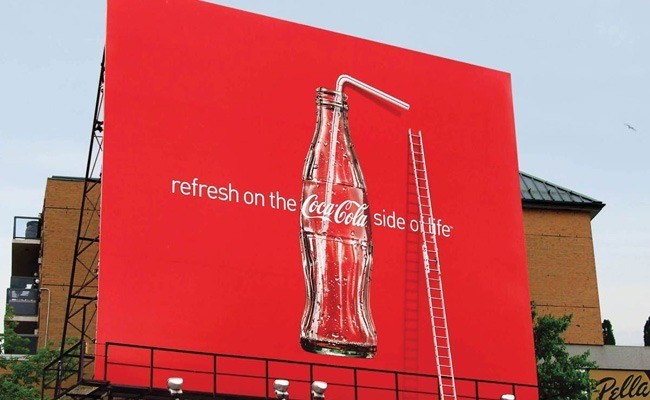
Coca Cola is one of the most iconic brands in the world and because of this, they have a good amount of money to spend on clever advertising campaigns such as this banner ad. As you can see, this banner is actually pretty simple and depicts nothing more than a bottle of Coca Cola with the slogan “Refresh on the Coca Cola Side of Life”. However, it’s what’s below the banner ad that makes it so great.
Clearly, you can see that there is a ladder located on the billboard platform which gives the impression that the drink is so great, someone resorted to climbing up to the straw to drink it.
You can see from the ad that the bottle of Coca Cola not only has a straw in it, but is also empty, which further ads to the banner.
What’s more, the use of the iconic red colour helps the ad to stand out and catch people’s eyes.
#3 – Belt Up

Source: EatLiver.com
We see a lot of different safety-related advertisements throughout our daily life and the aim of all of them is to make a lasting impression on us, so that safety can be improved. For example, there are regular TV ads regarding what to do if there’s a fire and so forth.
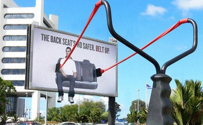
Another common safety-related subject is that of car safety, as depicted in this ad. Essentially, this great banner ad aims to highlight the fact that sitting in the back seat of a car without a seatbelt on is no safer than sitting in the front seat of a car. It’s a well known fact that crashing without a seatbelt on can result in the passengers being thrown through the windshield by the force of the impact.
This banner ad is extremely clever and depicts a slingshot attached to the backseat of a car along with the phrase “The back seats no safer. Belt up.”. It’s a clear message and the use of the slingshot definitely helps the billboard to stand out.
#4 – Penline Stationary: Strong Tape

Source: AdsOfTheWorld
Penline Stationary might not be one of the most household brands out there but once again, it just goes to show that you don’t have to be the biggest and most well-known company in the world to create a great billboard ad.
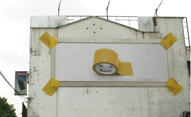
This banner ad was created to advertise Penline Stationary’s strong tape and as you can see, it depicts the billboard being held up by the tape itself.
Apart from this, it’s a pretty simplistic ad and basically, it shows nothing but a roll of the tape with the brand name printed on it. However, all of the work has been done by the idea that the ad is being held up by the tape it’s advertising.
It’s a clever concept, but also simple and because of this, it’s bound to catch people’s attention. The fact that the tape is yellow in colour is another genius aspect of the ad as it stands out from the dull wall on which it is placed.
Conclusion
While a lot of banner advertisements might be pretty boring, it’s important to remember that with a bit of creativity, you can actually create something that’s mind numbingly creative and will really capture the attention of your target audience.
As well as this, it’s important to remember that you don’t have to have a huge marketing budget to create a great banner/billboard ad. In fact, many of the ads featured in this post are extremely simple in their design and it’s the clever concept that makes them stand out, rather than the design.
If you want to create a fantastic and exceptionally creative banner/billboard ad for your company, start brainstorming and coming up with ideas. You don’t need an ad agency, just let your ideas flow and you’ll be bound to come up with something brilliant.
Author Bio: Josh has a passion for marketing and presently, he works for the UK based printing company www.discountbannerprinting.co.uk He helps to manage their marketing campaign and create effective designs for clients.
