Have you ever logged onto a website and clicked through so many links that you get lost in the maze and never find what you need? It’s a common problem for many organizations. They have forgotten that less is more, and are losing customers because of it. Forcing your audience to sift through pages of pointless information to find what they need will only cause frustration. The last thing you want to do is create a site that people want to bypass altogether.
This dilemma has led many web designers to streamline information down to its essentials and embrace the microsite. These one-page sites allow users to access all of the content on their site without having to load or refresh. Microsites can be really straightforward, like this ipod visualization or Landlord guide, and simply display the essential information. Or they can be really complex with games, videos and pop-ups providing enough entertainment so the viewer wants to stick around and explore.
Limiting your design to a single page can really push you creatively. If you have a lot of dense, diverse information then you should probably stick to a tradition website. But if you have limited content or just want to tease a product and really make an impression this unconventional layout may be perfect for you. Take a look at the four examples below for inspiration.
Inspiring Examples of Microsites

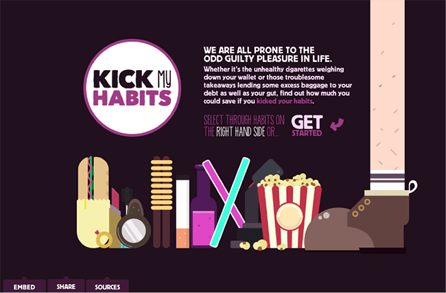
As a fun way to prove that Leeds Building Society can help their customers save money, they created Kick My Habits. Using animation, click navigation and scroll-over effects, they’ve created a fun quiz that shows you just how much you can save if you kick any of their predetermined habits.

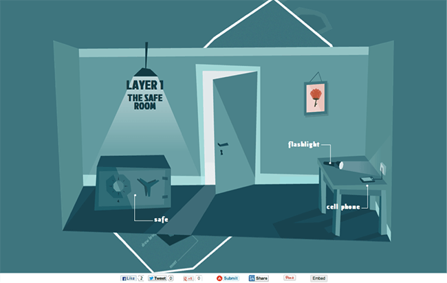
Using scroll navigation to change the screen images, this home security guide shows their customers exactly what they mean by providing “layered defense.” Starting with an overhead image, they roll through the layers of the house from room to yard to street pointing out all the ways your home should be protected. Using a simple design and color palette keep the focus on what really matters to the clientsecurity.

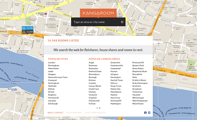
Kangaroom pulls out all the stops on their microsite, helping their customers quickly and efficiently find rooms for rent. The interactive map, acting as the background, zooms in when you click on it or choose a city or area. From there a sidebar comes up with information, including pictures and prices, of rooms available in the area. There is even a drop-down menu that allows you to adjust your criteria. They have provided their customer with a one-stop shop for finding and booking hotels on the go.

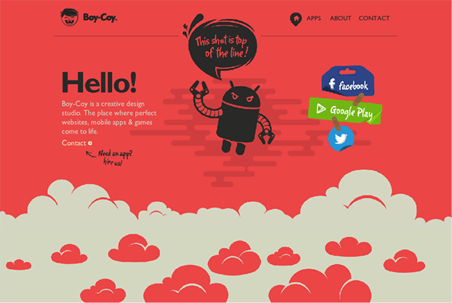
Boy Coy, a design studio, creates websites, games and mobile apps, something they clearly excel at based on their page. Skipping unnecessary grandiosity, they have provided all the important information and displayed their best work. With animation that comes alive with color and motion with the cursor or by scrolling, they relay their brand’s image and let interested parties contact them.
Created to meet different objective than other sites, designers should make sure that their site follows some basic guidelines. You only have one page, so make sure that you don’t fill it with a bunch of useless fluff. Stay focused on your mission and choose only what’s worthy of filling that limited space.
Also, make sure to lead your viewer along in a clear, concise manner. If the viewer can’t figure out how to navigate the sight and feels like they are just looking at random information they are not going to stick around. Bring the space to life and make your site memorable, but don’t confuse them by omitting icons, menus or other indicators that inform them that they need to feel comfortable. If you want the viewer to notice a link or buy a product you’ve got to make sure everything is easy to find.
