

Updated October 2026.
Binu Rojers paints places that feel remembered rather than photographed: whitewashed courtyards, a cottage alone in a valley, a fantasy canopy of pink blossom. His digital landscapes are built on a simple idea — pick one light source, commit to it, and let everything else fall into shadow around it. This profile looks at four works, the decisions behind their warmth, and how to study them without copying them.
Who is Binu Rojers?
Binu Rojers is a digital artist and illustrator from India. His portfolio on Behance moves between fantasy environments, travel-inspired architecture and quiet landscape studies. The subject changes; the treatment does not. Almost every piece is organised around a warm key light, a cool shadow family, and a clear focal point that the eye finds in under a second.
That consistency is the reason his work is worth studying. It is not the brushwork that makes a Binu Rojers image recognisable — it is the lighting plan.
Four works that teach lighting
1. A fantasy valley with one glowing direction

The 2014 valley is the most saturated piece of the four, yet it never feels noisy. Light enters from the upper left, so every trunk, rock and flower cluster has a lit side and a cool violet shadow side. The giant curving tree acts as a frame and a leading line at once, pushing the eye toward the distant arch and the flock of white birds.
Notice the restraint in the colour scheme: warm yellows and coral pinks in the light, lavender and deep blue-violet in the shade. Two families, repeated everywhere.
2. A cottage that reads as a single warm note
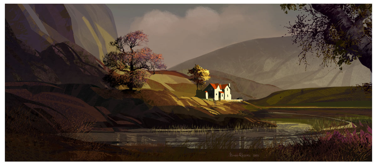
In the 2013 valley, the white cottage is the brightest object in the frame and the only place where the warm light lands at full strength. Everything around it — hills, trees, water — is pushed toward muted earth tones and soft grey-green haze.
This is a value strategy, not a detail strategy. Squint and the image still reads: bright house, mid-value hills, dark foreground. That is why it holds up at thumbnail size.
3. Travel illustration with a built-in story

The courtyard scene adds narrative to the lighting. The viewer stands slightly above the action, looking down into a sunlit square; the decorated elephant and the figures below give the composition a clear entry point, while the architecture leads the eye deeper into the frame.
What makes it work is the shadow pattern on the ground. The hard-edged shapes tell you the sun is high and the air is clear before you consciously read a single object.
4. A Mediterranean alley in two temperatures

The alley is the cleanest colour-temperature lesson in the portfolio: sunlit walls in warm ochre and pink, shadows in teal and blue. The diagonal shadow line does most of the composition work, separating the foreground roof from the bright street and pointing toward the arched door.
There is very little detail in the shadow areas — and that is deliberate. Dark shapes are allowed to stay simple so the lit surfaces can carry the texture.
Five things to steal (without copying the art)
- One light source, stated early. Decide the direction in the first five minutes and never add a second key light “for visibility.”
- Two colour families. Warm light against cool shadow, or the reverse. Limit yourself to two and the image will feel unified even when it is busy.
- Protect the focal point. Give the brightest value and the sharpest edge to one object only. Everything else softens.
- Use architecture as a frame. Doorways, arches, rooflines and tree trunks can point at the subject without drawing attention to themselves.
- Let shadows stay flat. Shadow shapes can carry mood and colour; they do not need detail.
A three-step study plan
If you want to learn from this work rather than just scroll past it, try this over one week:
- Copy a thumbnail, not the painting. Reduce one image to 5 × 3 cm and mix only five values. If the composition still reads, you have understood its structure.
- Repaint the light. Take your own sketch and apply the same warm-key / cool-shadow split. Keep the palette to four colours.
- Change the story. Rebuild the scene at a different time of day. Same geometry, new light — this is where the lesson becomes yours.
For more environment inspiration and motion-led storytelling, see our roundup of websites with amazing scrolling effects, or browse the inspiration archive.
FAQ
Is Binu Rojers’ work digital or traditional?
The portfolio is digital painting and illustration, built to read like traditional gouache and oil studies.
Can I use these images on my own site?
No. The artworks belong to the artist. This article uses them for commentary and critique; contact the artist through Behance for licensing.
What should I study first in these paintings?
Start with the shadow shapes. Block them in flat colour and you will see how much of the composition is carried by value alone.
All artwork © Binu Rojers, reproduced for editorial commentary. Source: Behance.

