Once again we continue with posts devoted to typography. I do believe that typography is something that any designer should involve in. Good typography is a crucial part of every design and that’s why it’s so important and not possible to discard it. A design with poor or no typography is an empty one.
1. Craft
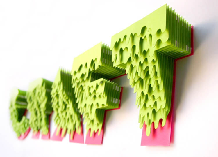
A very nice sample of papercraft and typography all put together. The design was created by Amalina Ahmad. The idea of this typography/craft project is to challenge today’s designers to look for alternative methods of solving design issues. It is better if you develop both digital and analog techniques in order to become a better designer.
If you want to find out more about this designer visit Behance profile of Amalina Ahmad.
2.Void
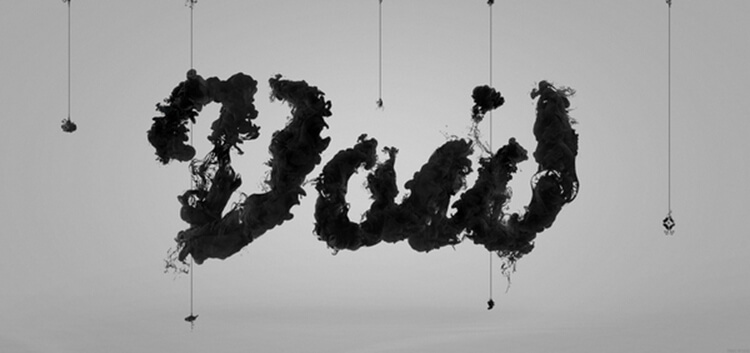
Void is a design of Goverdose and Tom Wysocki. It is a black-and-white typography project with a lot of chaos and liquid movement in it.
To find out more about the designers who took part in this project, visit Tom Wysocki and Goverdose.
3. Stay Golden
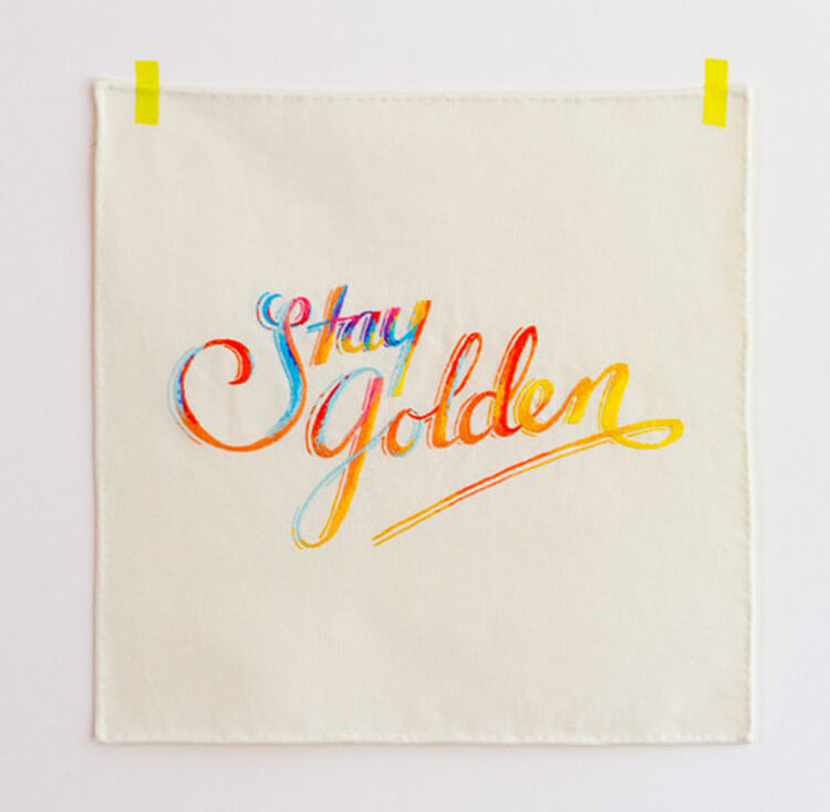
Stay Golden is a project made by Australian design studio MaricorMaricar. They specialize in hand-crafted typography and illustration. It is another interesting sample of alternative ways of expressing creativity.
To find out more about this design studio, visit MaricorMaricar.
4. We Believers
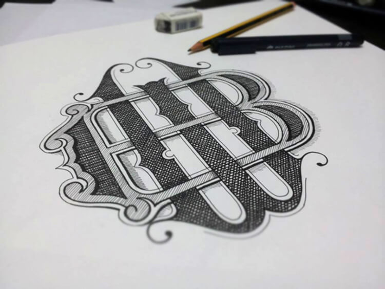
We Believers is a really nice example of good typography. It is created by Panco Sassano and it’s a design of 2 letters intercepting each other and forming a bond.
To find out more about this graphic designer and illustrator, visit Panco Sassano website.
5. Drool
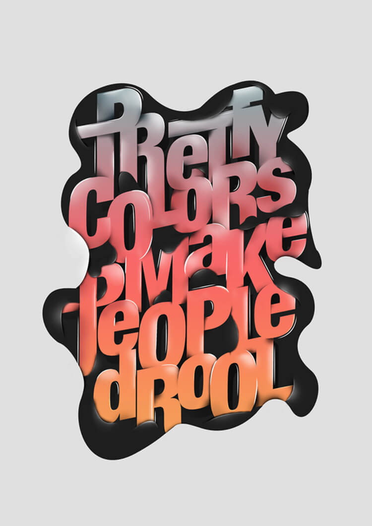
Drool is the creation of designer Fabian De Lange. It is a nice combination of color and shape, simple and clean with some background elements intercepting the text.
To find out more about this graphic designer, visit Fabian De Lange.

