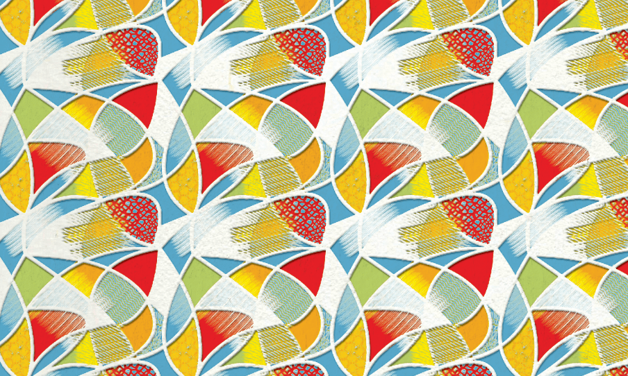
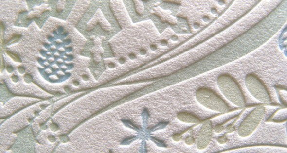
Letterpress is all the rage these days. This process is mostly used on thick paper, a.k.a. cover stock, if you speak printing. It is widely used on business cards and a lot of bridal party invites, save-the-date cards, or wedding invitations, not too much when printing direct mail postcards. Letterpress pieces are without a doubt very aesthetically pleasing as it offers your material more dimension and adds instant elegance to your prints. The economic downside, however, is one so significant that it might be enough for us 9-5 folks to reconsider. A letterpress business card could cost you up to 4 times as much as offset printing. If you’re wondering why it’s so pricey, here’s an elaborate article from Sugar Plum Invitations. Lucky for us living in the 21st century and thanks to the capabilities afforded by Adobe and other designing software, we can now emulate the letterpress effect without the actual letterpress printing cost. Awesome, right?
In this Design tutorial, you will learn how to add the letterpress effect to any image. Using Adobe Photoshop’s easy to use blending options and other simple tricks, even amateur Photoshop users can do this effectively.
The letterpress effect traditionally uses line art or simple typography. So you should take note that you must choose a simple line art image or text for this to be effective. Let us start.
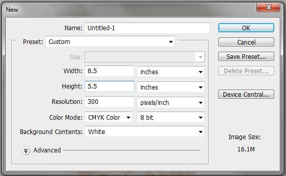
1. Opening Adobe Photoshop, create a new document by going to the menu bar and selecting File -> New… The new document settings should appear. Set the different properties as you need. In this tutorial, we used the following settings listed below. Save your new PSD document with an appropriate name. Use the following settings.
- Width: 8.5 inches
- Height: 5.5 inches
- Resolution: 300 PPI
- Color Mode: CMYK
2. Once the document is open, we copy-paste in the image or pattern that we want to have a letterpress effect. Once it is inserted, take note that you can scale the image by pressing CTRL+T which should activate the transform box. Hold down the shift key whilst altering the transformation box to resize your image to scale.
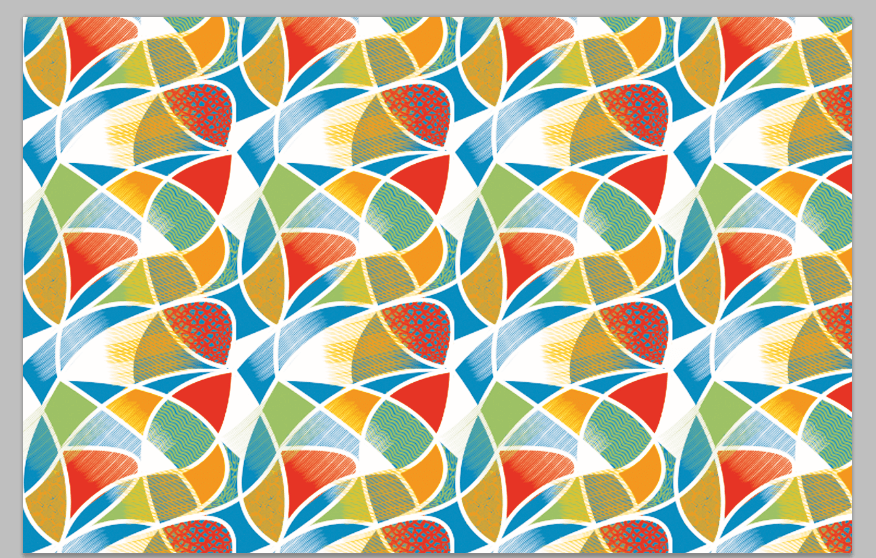
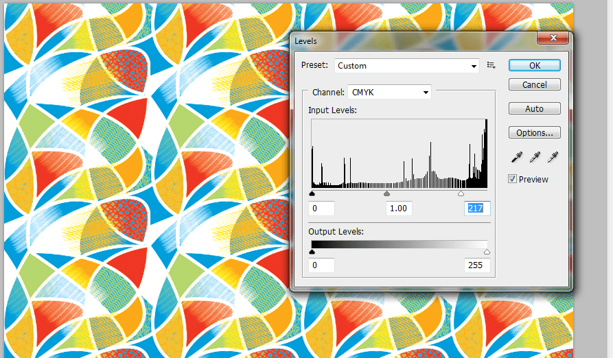
3. Now, this will depend solely on your image. It is important that you adjust the colors so that they are a bit vibrant or vivid. Also, if there are any pure black colors in your image, you will want to lighten it up. The best way to do this is with a slight levels adjustment. Just go to Image -> Adjustments -> Levels. Then in the window that opens, slide the right or left marker until your blacks are a bit gray, and the colors a bit more vivid.
4. Next, we have a preparatory step. We will need two kinds of textures. One for the standard paper texture, and another for the pressed texture. We got a few free ones from deviant art. We will be using this one: http://winryie.deviantart.com/art/Watercolour-Paper-Texture-170544084 from winyrie as the base, and this one: http://enchantedgal-stock.deviantart.com/art/Drawing-Surface-Paper-Texture-49817351 , from enchantedgal-stock for the letterpress. Download them or of course, get your own as you need.

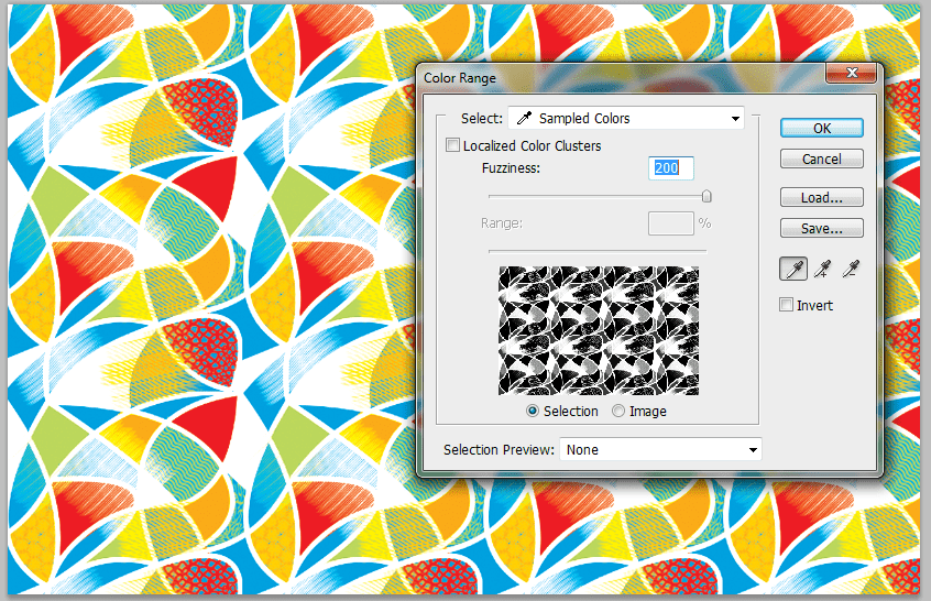
5. Now, we will do some tricks. First up, we go back to our main document with the pattern. We go to Select -> Color Range… and then we click on the “White” area of the document. Once done, press OK, and you will have selected only the white layers.
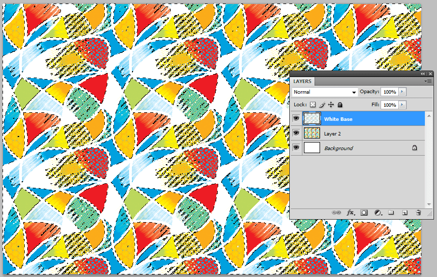
6. Then, press CTRL+C and CTRL+V to create a new layer based on our white selection. In the layers panel, rename this new layer as your white base.
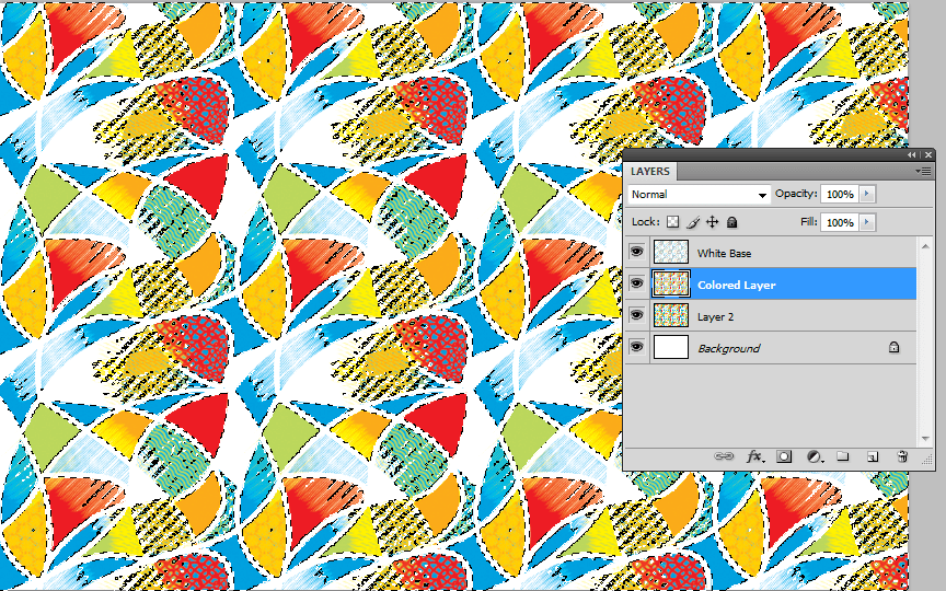
7. Next, click on the original image layer again. This time, press CTRL+SHIFT+I. This will invert our selection to the colored parts. Press CTRL+C and CTRL+V again to duplicate this colored layer. In the layers panel name this your Colored Layer.
8. Now we will work on the White base texture. Remove the visibility of the other layers first by clicking on the eye icon to the left of them in the layers panel. Then, copy-paste in our watercolor paper texture that we downloaded earlier. Make sure that this layer is on top of the base layer. Then right-click on it and select the option to “create clipping mask”.
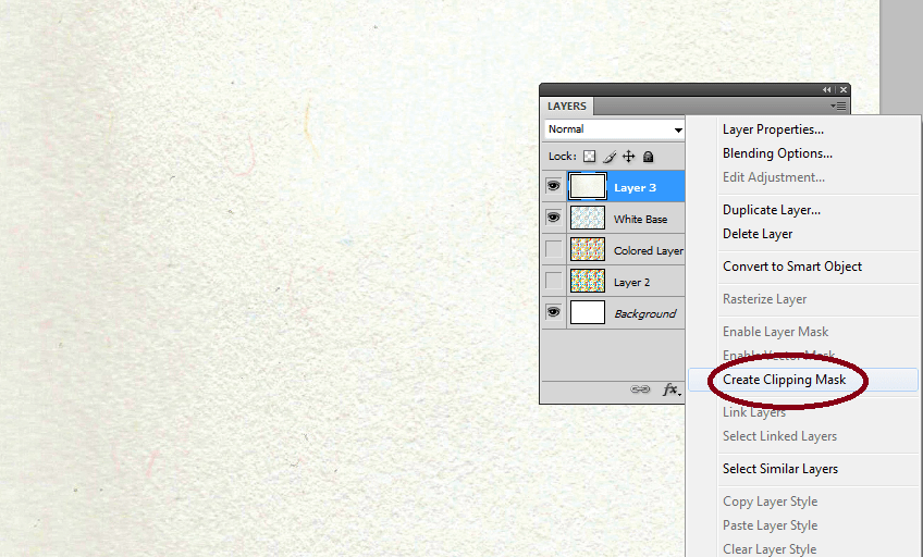
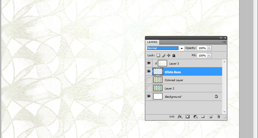
9. You should then see the texture get applied only to the area of our white base. Once you are satisfied, turn on the visibility of our colored layer.
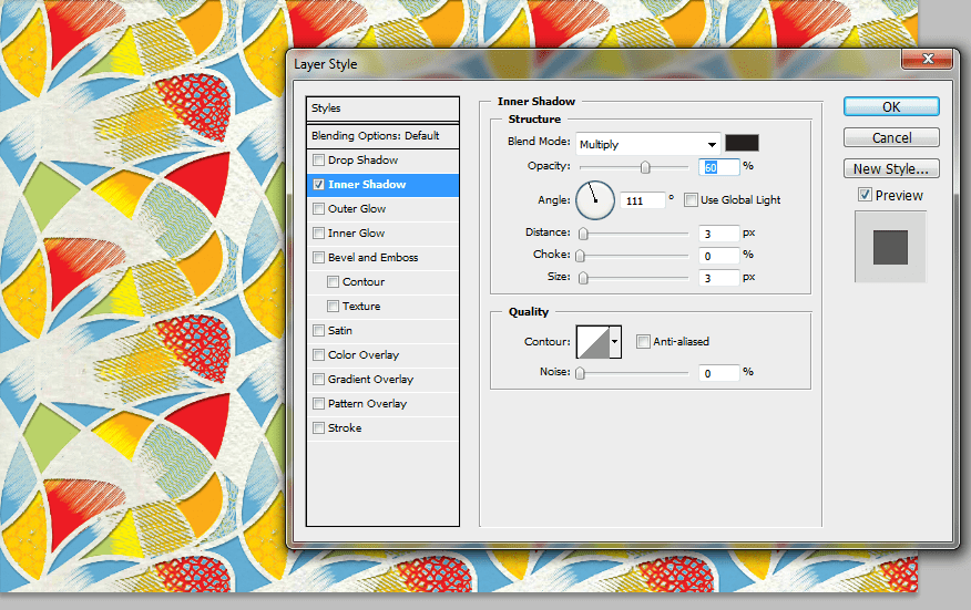
10. For the colored layer, we first double click on it to access its layer style options. In the layer styles window that opens, select the “Inner Shadow” effect. Adjust the following settings listed below as needed to make the shadow believable. We have inserted some basic values that you can start out with though. Once you are done, press “OK”.
- Opacity: 60%
- Angle: 111 degrees
- Distance: 3px
- Size: 3px
11. Now, using the same trick as with the white base, we paste in the other texture image we downloaded earlier. We place its layer on top of the colored layer and then add the clipping mask. (right-click and select clipping mask on the texture layer).
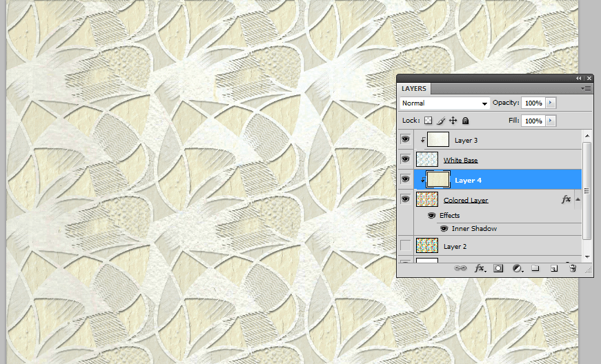
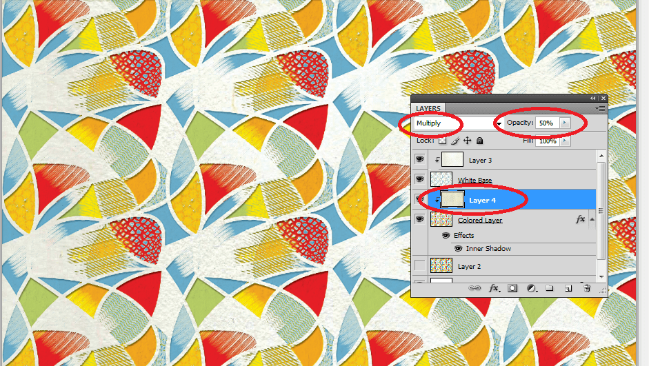
12. Now, we change the blend mode of the texture layer. Just look for the drop-down menu on the top left side of the layers panel. With the texture layer for the colored layer selected, change the blend mode to “Multiply”. Then adjust the opacity setting (just across from the blend modes) to around 50%. This gives us a subtle texture on our colored layer.
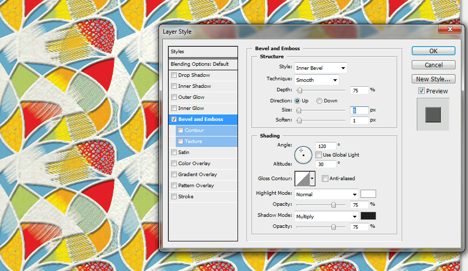
13. Then, we will add a small emboss on the white base layer. Double click on it to bring its layer style options. Click on the “Bevel and Emboss” effect. Then apply the following settings below.
- Depth: 75%
- Size: 5px
- Soften: 1px
- Highlight Mode: Change to normal.
- Leave the rest as default.
Great! That should finish our letterpress effect from a pattern or image. If you want a more embossed look, just adjust the settings as you see fit.
